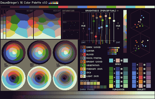
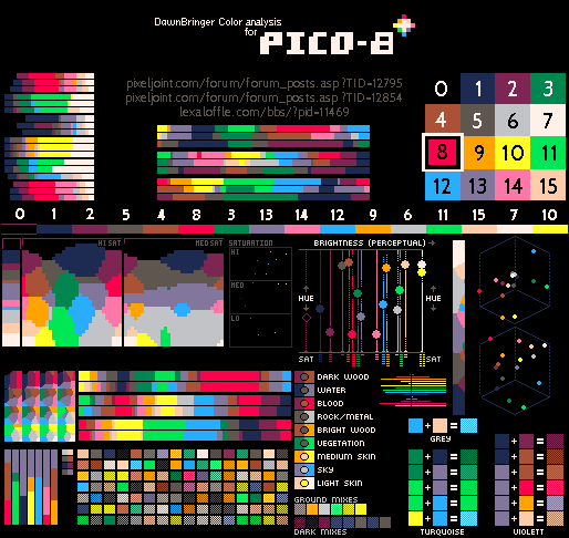
There is quite a lot of good 16 color palettes. I would personally like if Pokitto came with few palletes to choose from, similar to what TIC-80 does (run it, type DEMO, then LOAD PALETTE and finally RUN to check them out). TIC-80 Includes both DB16, PICO-8 as well as other classic (c64) and modern palettes.
One thing that I was planning to do for TIC-80 was to try to organize a contest/challenge on pixeljoint to make 16color palettes (and maybe a game mockup with it). My idea for the challenge was to create a palette for a game theme/genre (e.g sci-fi shootemup). The list of those themes would be created ahead of time and participants could either choose them or be randomly assigned one.
They made some in the past and I think it would be a cool collaboration in general. TIC’s author wants to wait until his “fantasy computer” is more complete to do it, but it would be a cool thing for Pokitto to do as well.
i feel a thing your missing is the resolution, wich your heaving to balance good looks from usable view
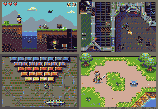
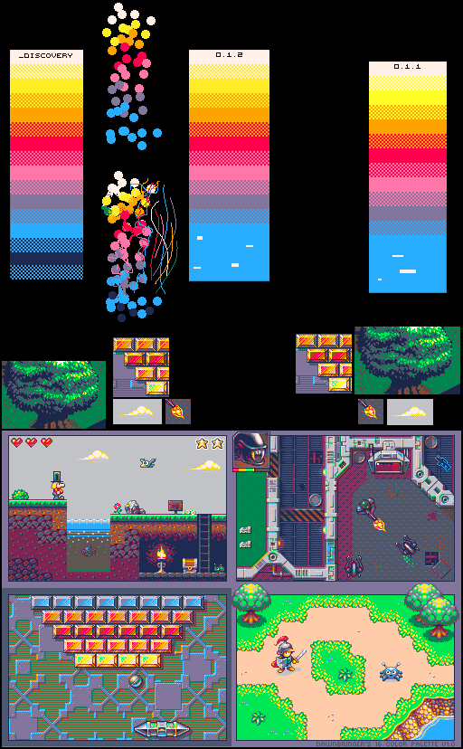
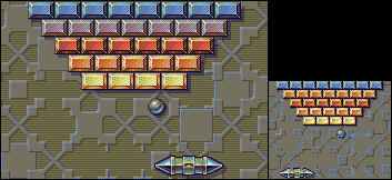
16x16 are nice tiles but you can only show 7x5 ish on the low res mode
Most of the games for Piko-8 use 8x8 tiles, which works on 16x16 tiles in its resolution (128x128). Pokitto’s low rez would give us 14x10, which is less, but I feel it would still be usable with many of the palettes.
I think it would be down to the programmer/artist to make sure the games are playable on small screens by using good contrast.
yes i know but how to make sure exactly like would you have some general guidelines, im using 16x16 tiles for my platfromer and i think there a bit to big
The problem with choosing palettes is that we have no idea how good the actual display will render colors. Older games use super bright palettes because the TVs and monitors of the time had low contrast and would not render all colors that well. With the advent of modern high quality and super high contrast display palettes have been moving in the super-washed out territory. These will look amazing on modern displays, but we have no idea how the Pokitto display will render them. It’s a tiny display with low power draw, so chances are it will not be all that bright or high contrast, so we might have to compensate for that with a palette using highly saturated colors.
We’ll know more when we get the Pokitto in our hands.
true but we got some idea of colors
also we can bumb up the pallets
i would stick to primes as much as possible if its really that 2000’s color cellphone look