I think it’s worth a try at least.
The advantage of mipmapping over bare scaling is that instead of being restricted by the quality of the scaling algorithm, you can take advantage of the human eye to create something that at least looks like a decent scaling.
For example, comparing the ones I made by hand:


With paint’s default ‘scale down’ algorithm:


If you zoom in, you’ll see mine bears a better resemblance to the orgiinal pattern.
Not necessarily mixing the colours, but determining which colour to use by looking at the corresponding pixel on both mipmaps.
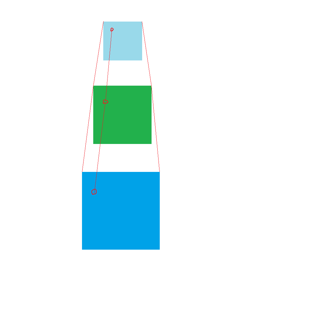
Basically, imagine the top left corner of each mipmap stage is (0, 0) and the bottom right is (1, 1) and everything between that is a fractional number between 0 and 1 (i.e. UV coordinates).
That allows you to figure out which pixel of a large image corresponds to which pixel of a smaller image by treating coordinates like percentages.
So then if you want to figure out which colour to use in a scaled tile you figure out its UV coordinate (i.e. it’s position as a percentage of the image) and then look at the corresponding pixels in the mipmap that’s larger than that scaled tile and the mipmap that’s smaller than that scaled tile.
Hopefully this image gets the idea across:
Green is the scaled tile, dark blue is the larger mipmap, light blue is the smaller mipmap.
You determine the colour by looking at both images and picking the colour somehow.
Though if we’re using the full 256 colour palette, then you could always set aside part of the palette for storing mixed colours and then just pick the colour by lerping between the mipmaps.
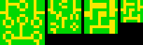
So far I don’t think I’ve use more than about 32-64 colours because I reused the ones from the ships for making the tiles.
 (from @Pharap and @adekto ).
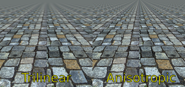
