Sorry for the delay in getting art up.
I had a few setbacks with some catestrophic bugs on the project I was hoping to be done with earlier in the week (mainly stack overflow bugs because I forgot to validate some data - you know you’re doing extreme and dangerous things when you get a stack overflow :P).
And if you’ve been following the other threads you’ll see I’ve had a powercut eat 4 hours out of my day so I’ve been unable to work on the art today.
Next week I’m going to set aside some time to focus on nothing but art for FZero.
The other thread has reminded me we never discussed the licencing for the art.
Do you have a preference for what you’d like to release the art under?
I’m happy to release under any of the Creative Commons licences (other than CC0).
The licences are also available in Finnish if you prefer. :P
(Though I doubt you’ll need that. I hear most Finnish people speak excellent English.)
I am currently making a tool chain, so that I can manage changing the global 256 color palette and easily add new graphics to the game. I was thinking to use ImageMagick, but ended up to use the good old NetPbm tools (+ Bmp2Pok ) for the task.
I will release the code under the MIT license or something like that. For the graphics do as you will.
It is true that you can manage quite well with English in Finland. Finnish itself is very far from English as a language, but we study English a lot at school. Also, foreign films are never dubbed here, except for small children, so we are “exposing” to the English language a lot
If you’ve got no plans to use this commercially then I’ll go CC BY-NC-SA, otherwise I’m happy with CC BY-SA.
(Even if we go CC BY-NC-SA, I’m happy to licence it separately to Pokitto Oy if @jonne has any plans about using it for promotional or financial purposes.)
It’s a very interesting language, particularly its rule about how suffixes change a word’s usage (I suppose technically it’s similar to how English uses different suffixes for different tenses, but it doesn’t feel that way).
It seems that quite a lot of countries do.
Yeah, I get what you mean.
I just wish more films were EN-GB instead of EN-US,
seeing American spellings everywhere on the internet drives me nuts. :P
Tangentally related, I watched a documentary called “The Rise and Fall of Nokia” earlier in the year.
It was very interesting.
I was there, exiting times! But what goes up, must come down. Nokia lost its mobile phone business to Apple and Google, but is still strong in mobile phone networks ( what many people do not realise).
Also, a lot of Nokia’s talented former employees have moved on to other tech companies, so it’s still making an impact on the world. :)
One of the former employees bought a laundrette. :P
Another interesting thing, they showed this guy who had built a modern smart phone (touch screen, swipe action, internet browsing) back in 2002, and none of the companies would touch it.
The day Apple announced the iPhone he got so angry he threw his phone at the wall.
Unlike an iPhone it didn’t break.
Me being a libre-freak I’d probably want to create a CC0 alternative graphics, @Pharap and @Hanski would you be okay with it? @Pharap’s assets would stay as the default ones for the game demo while there being a folder with my assets as an alternative – could that be?
Speaking of which, got a couple of different palettes for you to chose from for the revamped ships:
Green
Blue
Yellow
Pink
Grey
Each ship uses 4 colours common to all ships and 4 unique colours.
Since each ship has 4 levels of shading,
it should be possible to substitute the 4 unique colours,
effectively leaving you with 5 ship styles and 5 ‘paint jobs’, for a possibility of 25 total ship variants.
Any idea how long before the code is made public?
(Or is it already public and I missed the link?)
Let me know which of those palettes you prefer so I know how many colours we’re up to.
If I can think of something to contribute then I’d be happy to contribute something.
Programming is what I usually do after all.
I’m not afraid of messy code, I’ve seen a lot of messy code over time.
But if you’d rather not have to deal with git during development then I understand that.
I sometimes don’t publish to GitHub until I’ve got a fully working game.
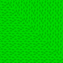
Here’s a grass tile to trial.
It reuses the greens from the ‘Pokitto’ ship palette.
I was there, as a young student. My colleagues made the mechanical design. The MyOrigo also had haptic response AND an accelerometer. It was too ahead of its time: there was nothing to consume on that device, and mobile web browsing was still a joke. Apple succeeded because iPhone built on the success of iPod: the 1st gen 2G iPhone was not an internet device, and early iPhone adopters were iPod users - a detail often forgotten. BTW, Nokia should be given zero credit for the MyOrigo device. They just failed to do anything about it. The whole hardware / software design was not Nokia.
If there’s one thing I’ve learned in the last 2-3 years it’s that you have to allow for one or two off-topic comments because they give a forum intrigue and character.
I never owned an iPod, but they were notable enough by the time I came to do my GCSEs that the examiners would often say ‘iPods’ instead of ‘mp3 players’.
I remember some of the students would ‘jailbreak’ theirs.
(I much preferred my friend’s Archos media player to the iPods.)
I’m not surprised that it was the iPod’s success that the iPhone piggy-backed off of.
I’ve never been one to be taken in by branding, but a lot of my peers were the kind of people who wanted the flashiest phones, clothes etc.
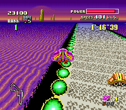
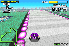
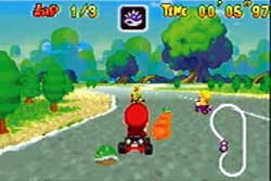
Is that tileable? It also would be better to do the tiles so that they can be used in any degrees : 0,90,180,270. When testing that I got a bit of Mario Kart feeling It is a great game, but I think somewhat more futuristic or sci-fi style would fit better with the ships. What do you think?
Hm, if your tile is all-direction compatible, you’ll lose even more the depth effect.
One way to circumvent this would be to select a different tile depending on the “camera angle” -which, I think, depends solely on the X coordinates of the center of said tile. Like, make the tile seemingly look at you by having 0, 45, 90° versions! Not sure how to do that thought without losing too much perfs
I was planning to do water, grass and dessert tiles.
I was waiting to see which blues and yellows you picked to see if I could re-use them for tiles.
(I know there’s a large limit on the tiles, but as I said somewhere else - “it’s easier to add detail than it is to remove it”.)
That will be more difficult.
It’s easier to do that with abstract patterns, but it’s difficult with things like grass.
Not necessarily.
Think of this:
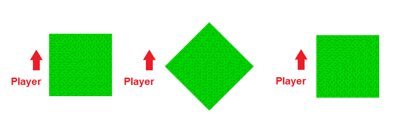
The player is driving along some straight road and comes to a right hand turn.
While they’re driving along the straight part of road the grass tiles all face up.
When they get to the corner, there’s some tiles facing up and some facing right.
As they turn around the corner, the tiles that were facing up now face left and the tiles that were facing right now face up.
So before the corner the player has this on their right:
And after passing the 45 degree point they have this on their right:
It might work, it might not, we’ll have to see.
Edit
In case that wasn’t confusing enough, here’s a crudely drawn paint diagram:
One alternative is to have ‘billboard sprites’ for objects on the side of the road and use those to give depth.
You probably know what billboard sprites are, but for those that don’t, they’re a trick used in 3D games to make a 2D sprite appear 3D by making it face the camera at all times.
The trees on the left here in Mario cart are an example of billboard sprites in action:
Using billboards to give a sense depth would allow the grass/sand/water texture to be less detailed and thus support rotation.
A third possibility is to have a ‘45 degree’ version of each tile to make the corner transition smoother.
That way you could go ‘0 degree -> 45 degree -> 0 degree’ and it would look natural.
45 degree sprites are tough to pull off though.
The idea of having rotated version of the textures could work, but it’s really not needed, no one will notice that. I really think you can happily just ignore this issue.
Some inspiration from OGA (you can even reuse these): 1234.
This is a very good idea and I think it would be great to add to the demo.
BTW do you plan to make the camera movement more smooth? In the video it seems like it’s completely fixed to the vehicle. I think in racing games the camera should be tied to the vehicle with kind of a rubber band, because the view needs to always move and rotate smoothly, which isn’t always the case with the vehicle (crashes etc.). It also just looks better, more realistic and “3D”.


 It is a great game, but I think somewhat more futuristic or sci-fi style would fit better with the ships. What do you think?