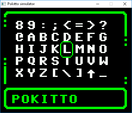
I am making common UI widgets for Pokitto. Jonne makes the Loader dialogs, but these widgets are more generic. You can use “stock” widgets in your apps and games, or create own custom widgets by class inheritance. The look of the UI is based on the excellent UI mockup by @spinal. So far I have implemented window with a frame and a title (both optional) and integrated the listbox by @Initgraph to the widget system.
This is how the custom widget above has been created:
/** CUSTOM WIDGET */
class MyCustomControl : public Pokitto::Window {

public:
    MyCustomControl() {m_listbox = NULL;}
    ~MyCustomControl(){delete m_listbox;}

    init() {
        setTitle("POKITTO");
        setRect(0, 0, game.display.getWidth()-1, game.display.getHeight());

        int16_t vx, vy, vw, vh;
        getViewRect(vx, vy, vw, vh);
        m_listbox = new(std::nothrow) Pokitto::ListBox(Pokitto::WidgetBase::hasBorders);
        m_listbox->init(vx, vy, vw/Pokitto::fontW/2, vh/Pokitto::fontH - 2, 100, 0);
        char itemName[256];
        for (int16_t i=0; i<50; i++) {
            sprintf(itemName, "%d\. ITEM 1234567890", i);
            m_listbox->addItem(itemName);
        }
   }

    // Inherited
    void draw() {
        Window::draw();
        m_listbox->update(); // To react scrolling
        m_listbox->draw();
    }

public:
    Pokitto::ListBox* m_listbox;
};

/** MAIN */
int main () {
    game.begin();

    game.display.setFont(fntC64gfx);
    game.display.palette[0] = game.display.RGBto565(0x0, 0x0, 0x0); //default background is palette[0]
    game.display.palette[1] = game.display.RGBto565(0x00, 0xff, 0x00); //default foreground is palette[1]
    game.display.palette[2] = game.display.RGBto565(0xff, 0x00, 0x00); // red
    game.display.palette[3] = game.display.RGBto565(0xff, 0xff, 0xff); // white
    game.display.charSpacingAdjust = 0; //needed for the non-proportional C64 font (normal value=1)

    MyCustomControl* control = new(std::nothrow) MyCustomControl();
    control->init();

	bool mustDraw = true;
    while (game.isRunning()) {
        if (game.update()) {

            // Draw
            if (mustDraw) {
                game.display.color = 1;
                control->draw();
                //mustDraw = false;
            }
        }
    }

    delete(control);
    return 1;
}
Next I will be making the Cancel and Info dialogs. Please let me know any ideas about the look-and-feel or functionality of the widgets.
Thanks @Hanski. I think that now as we are at the early stages of making these widgets, its good to discuss some design goals.
What I think these widgets need to provide is:
a very easy api for beginners
abstraction of widget input/output from ui appearance, so that skinning is/becomes possible
What I mean by point 1 is an additional layer of abstraction with pre-prepared stuff that makes creating a new dialog/listbox a one to 3 lines of code max
I am also going to put all the string constants (like “OK”, “CANCEL”, etc.) in one header file (common to all system SW). That will make it easy if someone wants to make a localized version of the Pokitto SW.
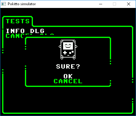
Now the first version of UI widget framework for Pokitto is ready.
Example of creating and using of the Cancel dialog widget.
// Create the widget
Pokitto::CancelDlg* testDlg = new(std::nothrow) Pokitto::CancelDlg("SURE?");
...
// Draw the widget
testDlg->draw();
...
// Check the state of the widget
bool done = testDlg->isDone();
bool selOk = testDlg->isOk();
Base classes:
WidgetBase
DialogBase
ListBox
Stock Widgets (can be used directly in the applications):
InfoDlg
CancelDlg
ListBoxDlg
Note: To be able to use the widgets, the application must:
Use a special font: “fntC64gfx”, which contains UI graphics in the lower case letters. So only upper case letters can be used for texts.
Set the UI colors in the palette indexes: 0 (background color), 1(border/selection color), 3(UI text color). UI widgets have been tested in HIRES(4 color) and FAST(16 colors) gfx modes.
See the example in: EXAMPLES/UIWidgets.cpp
As you see there are not many widgets yet, but this is a start Keep telling what is needed next or what is not working.
The widgets are available for using in your own applications as soon as Jonne gets the pull request merged.
I really think that you should create a template that includes use of all of these different features so people can use it to help them understand the code, but to also give developers a starting point who want to make a functional app a little faster for testing purposes.
For instance, when I create a program to test connecting to my keyboard, I’d like to be able to just apply the functions to menu items without building the entire menu.
It would be cool to do include menu options similar to…
Have a look in “examples/UIWidgets.cpp” in the Simulator codes. There are examples of usage for all widgets. It is not a template, but using the widgets is really simple, just a couple lines of code.
Having also a wiki article about using UI widgets would be nice. Any volunteers ?
I am currently a bit busy. It would also be a good design review for widgets if someone else did it.

 Keep telling what is needed next or what is not working.