You could say “I’d rather you didn’t post it because you didn’t ask permission”,
and then I wouldn’t be able to publish it because I’d be bound by my word.
(Bear in mind the only photo I had to go by was the one on the forum with your chin hiding behind the Pokitto magazine volume 1.)
Sent @Pharap a PM with a photo of me and will await the results.
One thought I had for the review section is a brief, “Meet the Reviewers” portion that I’ve seen on occasion in some magazines. It’s usually like a very short interview with some basic questions related to gaming in general with a final question on other interests.
My thought was something like this:
Favorite genre and why?
Platformers because of the skill needed with precision jumps, and even knowing where to go and what to do there’s still the challenge of execution.
Least favorite genre and why?
Strategy because I’m not very good at strategy, though I still enjoy a good strategy game it’s just not my go to genre.
What do you look for most in a game?
I usually care more about gameplay, depth, and story rather then graphics.
What’s your favorite game so far for the Pokitto?
That’s not an easy question though I’d have to say Celeste Classic, but Legend of Lania definitely has potential.
What are your hobby’s outside of games?
Mostly I like reading, mountain biking, board games, and painting miniatures.
Score wise I always kind of preferred the out of 5 for these reasons:
Didn’t play it enough to give it a fair score
It really failed hard, but still pretends to be good (really difficult to earn a 1)
It has its moments, but otherwise still needs some work.
Overall not bad, has a few rough edges, but they’re easily forgiven.
Wonderful execution, minor annoyances that are mostly just difference in taste, but otherwise very solid.
Absolutely flawless and there isn’t a single thing I would change or do differently (also should be a very rare score, but to each their own).
This is definitely true. As I’m going through and playing a bunch of games and giving a quick 2-3 sentence review I’m keeping in mind the target audience (usually the developer) as well as the overall budget of these games (which looks to be an average of $15 USD depending on how much coffee was needed).
Most of what I work on is just done to share something decent for free with online friends. And according to my wife, I am giving way too much of my time lol. So harsh review are harder to take in that setting so a decent margin for rating is welcome I think. So more chances for nuances in reviews if out of 10. But then critique isn’t always easy to deal with but does help people to get better when used correctly.
Unfortunately everyone will have to wait until I can get some feedback on image dimensions.
I don’t mind doing practice runs when I have free time,
but I don’t want to put in effort only to find out I’ve made the images too small.
Seems like a good idea to me.
I agree. 5 just isn’t subtle enough unless you allow going into decimals (e.g. 3.7),
but at that point you may as well go out of 50 or out of 100.
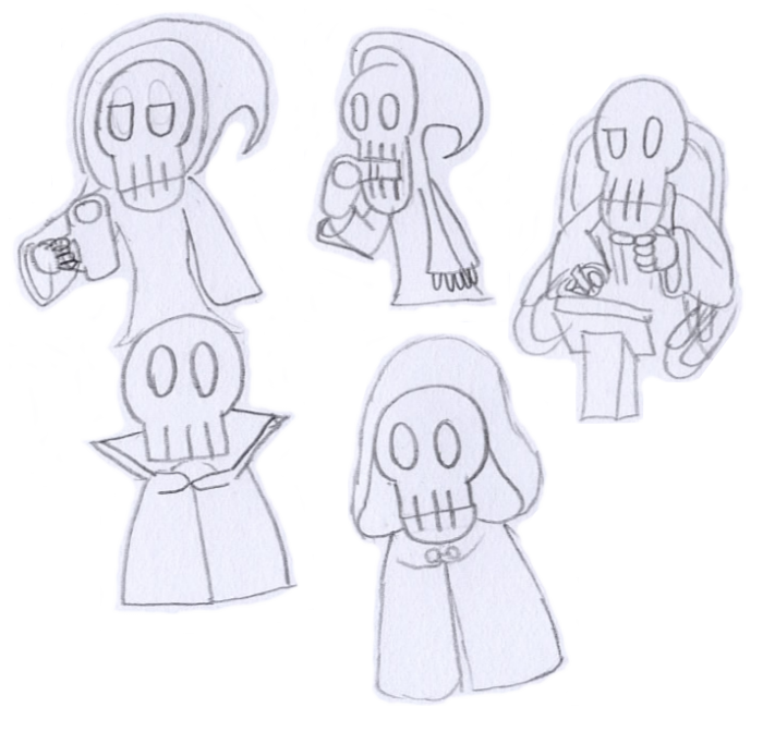
The robe on the two in the top left is indeed the same one Grim wears.
To find a suitable style I looked at various different illustrated skeletons including…
list...
Grim
Various incarnations of Death from the Discworld series
Various skeletal creatures from the Mario series
Real human skulls
Various other illustrated skulls
Note that I specifically did not look for Sans from Undertale or Jack Skellington from the Nightmare Before Christmas because those are very much not the style I was aiming for.
Grim’s a very good incarnation of the grim reaper:
He’s expressive, iconic and an interesting character in his own right.
(Also, all the fanart done in drastically different art styles is both amusing and useful.)
But he also has features I wanted to stay away from (e.g. square jaw, eyebrows) and some I decided I didn’t like the look of (e.g. cheekbones, nose hole, square fingers, three fingers),
hence the skull is quite different (based more on my icon/logo).
His robe is particularly nice though,
I couldn’t resist ripping that off directly (for the sake of a practice run).
I doubt I’ll be able to come up with a better replacement.
(Maybe I’ll ‘borrow’ a robe from an Elder Scrolls game and see who notices. :P)
One article I read on making good programmer art recommended drawing at 10x the final resolution (so a 32x32 sprite would start as a 320x320 image). I’m wondering if you might be able to start with a large image that can later be cropped, scaled, and smoothed out once an exact size is known.
Theoretically I could even produce a vector image (e.g. .svg) that could be resized to any scale,
but that would take a lot more effort than producing a normal image.
I’d rather start with a known intended size because that makes it easier to know how big to draw the initial image, whether it has to be rescaled as part of the digital tracing & colouring process, and if so then by how much.
At the very least I need to know the aspect ratio.
I don’t want to go drawing portraits in a 3:4 ratio only to find out they’re supposed to be going in a 1:2 box, that would mean a lot of wasted space and would probably look quite odd to say the least.
Honestly, I think that actually looks worse than the original,
both the wobbly outlines and the shading effects.
The hair highlights aren’t so bad, but the rest just looks odd to me.
I tried to upload the .svg that GIMP spits out,
but the forum’s rejecting it so I’ll have to host it here as a gist.
(JVx1.svg is what GIMP spits out, the rest are mostly the same file, but with the decimal point moved along to effectively scale the image up.)
Aside from some of the lines not touching when they should and the obvious lack of colour, I think this looks better.
The former is seemingly easy to fix in Inkscape (which I have attempted here).
(I say ‘seemingly’ because SVGs (in general) have a habit of doing strange things after scaling them beyond a certain range unless the values are chosen very carefully.)
Adding colour seems to be more difficult, but perhaps that’s partly because I don’t have much experience with Inkscape.
At any rate, I much prefer being able to just do raster graphics because I know where I stand and what effects I can manage.
Assuming you mean Adobe Illustrator, I simply can’t afford it.
Especially now they’ve switched to a subscription model.
I don’t doubt you would have managed better shading given more time,
but I expect the blobby lines are just an artefact of how Illustrator infers lines,
so I’m doubtful you’d be able to rectify those unless there’s some factor I’m not aware of.
At any rate, this discussion of vectorising doesn’t really help with my immediate problem of what sort of aspect ratio (and possibly dimensions) I should be aiming for.
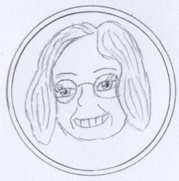
 great! Reminds me of someone…
 )
) so a decent margin for rating is welcome I think. So more chances for nuances in reviews if out of 10. But then critique isn’t always easy to deal with but does help people to get better when used correctly.