How about the, now traditional, interview of the jam winner? I think we can use the same questions as in the first issue. There have been actually two jams since the first issue.
5 Likes
I can do this also. The Java Jam was won by @HomineLudens and @Vampirics, the Punk Jam was won by @spinal. Are 3 interviews too much for one issue?
4 Likes
I don’t think that is too much. Though I’m not sure if we have a size limit?
1 Like
3 is too much IMO. I can skip. I’m also quite a shy person so I feel quite embarrassed to be interview.
Are you sure? This might be the one and only chance to have an interview in the mag, who knows 
1 Like
Here are some guidelines for the articles:
1 Like
@jonne Was there enough sales last time that we are going to have the paper version also this time?
If yes, I suggest a smaller font size (was it 12 pt in the mag?). Compared to the other paper magazines the font looked too big.
Also the resolution of the pictures should be big enough. Even if it the picture might look good on the screen and in the PDF, it can look crappy on the paper because of higher DPI.
3 Likes
Almost all of the magazines are gone. Maybe 4-5 remaining. So yes.
4 Likes
maybe this time i don’t need to pay extra shipment  ?!
?!
2 Likes
Great! I can take care of it also this time. I might get a bit better deal now, let’s see 
@vampirics, do you happen to remember the font size in the issue #1? What would be a good resolution for the pictures if, for example, the picture size is 1/4 of the page size?
1 Like
In general for printed document all image should ideally be at 300dpi. As for the font size, for optimal readability 11pt is best but a lot of magazine even use 9-10pt. In the first magazine issue I went for 11 or 12pt I think. Mostly to have a couple more pages to not look like a flyer 
Depending on your audience, older people might enjoy the font being not too small. But that’s up to you guys.
3 Likes
I can’t promise anything as it’s getting crazy at work and don’t have much time. Also it’s still not clear what kind of cover you wanted. Last time I suggested an illustration and you came back saying you want pixel art. Also do you need a full page art and you will overlay text over it about the other articles?
1 Like
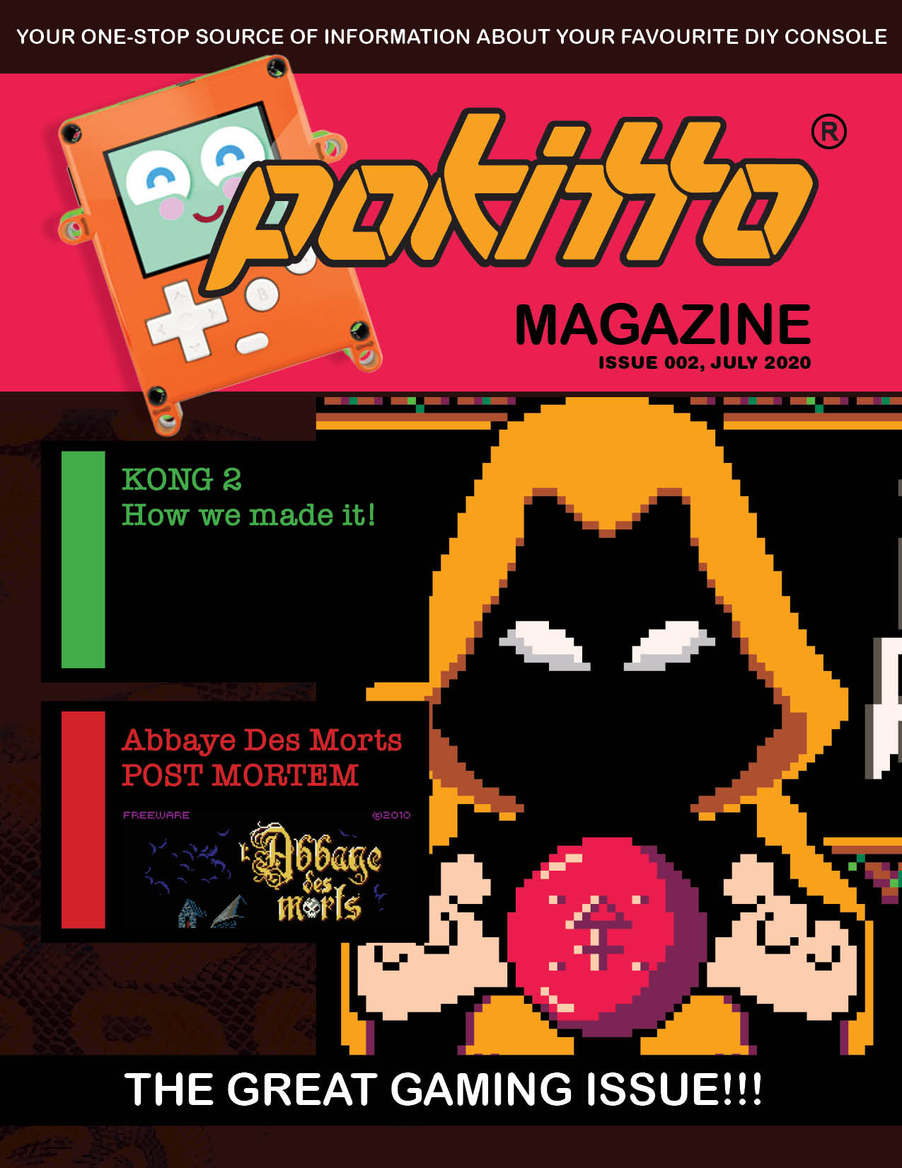
… ok. I will at least make you something a little better then just the title screen graphics. But if it’s the kind of thing you want I should be able to provide something fairly quick then
2 Likes
I am not sure if I want that. I am kind of liking the “Assasins Creed at 2dpi” look
1 Like
If you are going that route I would suggest making the top of the hoodie overlap over the magazine header as if it’s going out of frame at least.
I want some sort of drama in the cover. There is so much flat colour now. Suggestions more than welcome
We need one more person for the editorial work, to help out @torbuntu
Any volunteers?
Edit: maybe 2 people. Naturally paper version of magazine for the ones who volunteer.
3 Likes