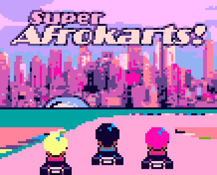
Graphics: @Pharap (the textures), @jpfli (the title screen), @Vampirics (the number font),the user AndHeGames in the opengameart.org (opponent characters)
Doesn’t matter if it’s ‘commercial’ or made by a random person on the internet.
Unless it’s explicitly marked as free for use, it’s no good - someone has a copyright on it.
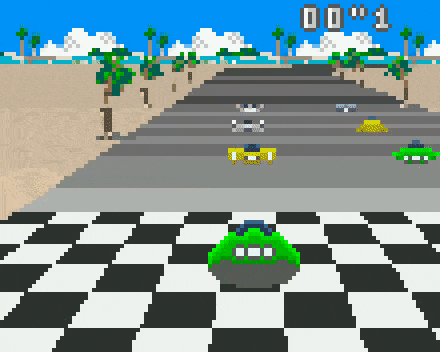
It seems to be from a public domain mode 7 demo for gameboy color. I won’t link to any download site directly for copyright reasons (commercial roms), but googling “mode 7 demo kart sam blanchard” will find it no problem.
I’ve tweaked the colours to be 1:1 with RGB565 and started tracking the palette.
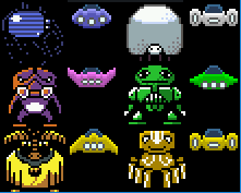
I’ve also modified the ship slightly to give the wings a better shape:
(T is for ‘transparent’)
How many ships are needed?
What other sorts of graphics are needed?
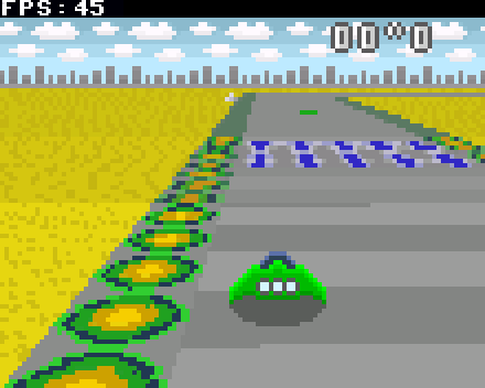
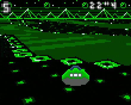
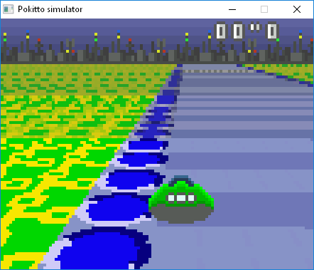
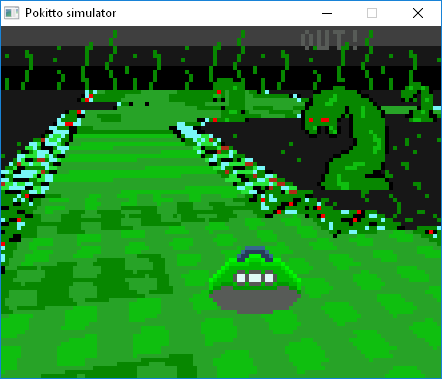
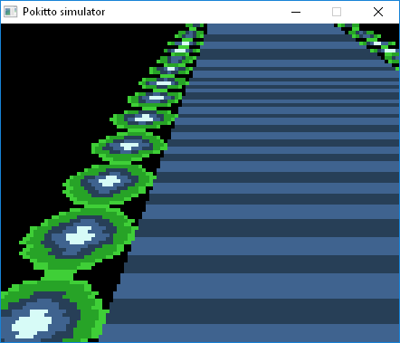
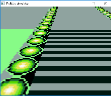
As can be seen above the road edge do not look very good when scaled down. The reason is likely that the scaling is done without filtering (e.g. calculating average of the pixels) for performance reasons. It just skips pixels. The way to make it better is to use a technique called Mipmapping. It means that there are pre-scaled bitmaps of e.g. sizes 1/2, 1/4, 1/8, etc of the original. The pre-scaling is done using filtered scaling. So, in run-time, when the size of the scaled scanline is 1/2 or smaller of the original bitmap, we use pre-scaled bitmap instead of the original. That should improve the quality of far away pixels.
@Pharap, sorry about the confusion. I just thought to write a general “DevBlog” entry. I am not addressing it to you I was expecting that you are familiar with Mipmaps
I will.
Currently, I am doing mipmap bitmaps by hand (using Gimp, cubic scaling). If that improves the quality enough and I am taking them into use I will have to switch to mode13, 110x88x8 bits.
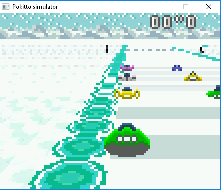
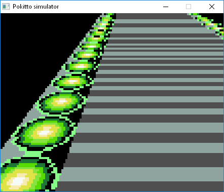
Looks like the actual effect of mipmapping is really small. Below is a screenshot of mipmapping in use. It starts to effect after the fifth ball. I impelemented mipmapping just for the balls, that is why the other graphics look different from the original.
correctly
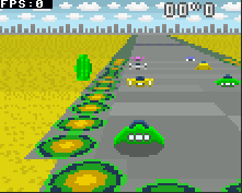
For the comparison, here is the original image again.
Two ships that I can’t decide the colour arrangement for:
I’m thinking about replacing the Pink with purple so that might help me decide.
And finally the updated colour palette (one colour still unassigned):
Note that all ships have thrusters, but in different arrangements,
and all ships have cockpit glass, but in different shapes.
It’s the little details that count.
Though now I think about it, maybe all the ship colours and styles should be interchangeable?
So you get to pick a style and colour combination.
That would give 25 possibilities instead of just 5 possibilities.
Great! I like how the ships are shaded. “Pokitto” is my current favourite Can you make the ball shaped texture a bit more 3d-like? In F-zero it looks like a light bulb. Could it be shaded like a button, e.g. like Pokitto A/B-button?
I am using now the mode13, so there are more colors available
Btw. I am going to a summer cottage for a week, so I cannot code during that time, but can discuss

 I was expecting that you are familiar with Mipmaps
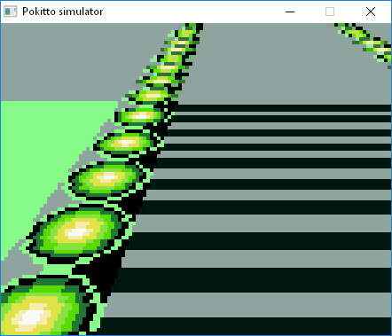

 Can you make the ball shaped texture a bit more 3d-like? In F-zero it looks like a light bulb. Could it be shaded like a button, e.g. like Pokitto A/B-button?