Looks nice!
Just that the shadow near the cannonballs looks a bit “thick”.
I kind of noticed that after a bit. Initially my thinking was how the railing curves upward, but I don’t think it would cast that much of a shadow, so I fixed it up a bit.

Next up is a bit of an interesting process with a failed first attempt at creating a pirate/brigand enemy.
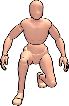
To start off with I used a 3D posing software to help get a reference for the pose I was thinking of.
Traced an outline around the key features then scaled it down and adjusted the brightness and contrast to give a solid outline and 3-color shading. However, comparing it with the ship background made it not very menacing looking and the size left very little detail for the head/face.

Still thought I’d try and color everything in with the initial color scheme to see if I could fix it up a bit and make it work.
![]()
This is where I left off before debating about starting over. It’s not terrible, but the size just doesn’t do much good at making a more menacing enemy. The swords are just the right size for the sprite, but they’re far too small overall and there’s no room for any kind of facial feature/expression.
![]()
At this point I decided I would start over and work on fixing my proportions and sizing a bit.
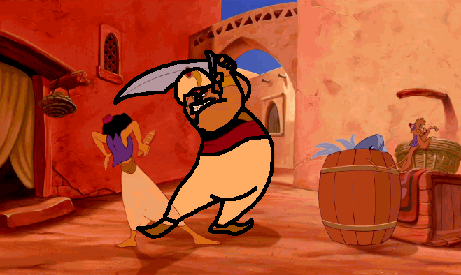
For this next part I was actually re-watching the Aladdin (the original animated one) and right in the beginning this scene jumped out at me.
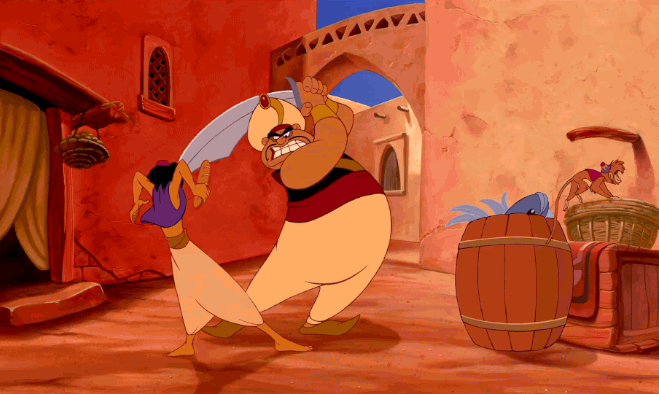
I knew right away that this would make a great pose for my sprite and would most likely have good proportions so I drew a nice thick outline around the key features.
Cropped out just the body and scaled it down to the size I needed.
![]()
Did the initial coloring
![]()
Then checked to see how well it fit on my ship background.

I really liked the way this sprite was looking so far so I copied it into Aseprite and started detailing and shading it.
@torbuntu and I noticed right away though that the sword needed to be bigger to be more menacing looking.
![]()
Here is the framing I decided on to help with the overall size of my enemy sprites.
![]()
The big red one is the max sprite size of 48x48 and is mostly for bosses. The green one is 32x32 and good for smaller enemies. The nice thing about this is isn’t to say that the small enemies have to fit in a 32x32 sprite, instead the perceived bulk of the sprite should fit inside it and any details can extend beyond a bit as needed (like the sword and raised arms for example). Even this guys head goes just slightly outside the 32x32 region but the perceived bulk remains inside the boundary. Any parts extending beyond the 32x32 box should try not to go too far past the 40x40 orange box otherwise they might not look as good. Bosses will mostly like have their bulk be inside the 40x40 region with details extending out to the max size.
All that aside I finished up the detailing and shading of the sprite
![]()
Though I wanted to make the arm look a little bit more muscular if possible but couldn’t seem to make any amount of shading look good with the limited space and colors. However, I did discover that simply extending the outline at the elbow by just one more pixel helped make it seem bulkier and looked better.
![]()
And here he is looking nice and menacing against the ship background.

Overall it turned out really great and it’s yet another sprite that I’m quite proud of.
6 Likes
I’ve moved the project over to c++ (was mostly using pine2k for quick prototyping)
I’ve got the map system rendering (and created a ChunkMap library that I’ve posted on the forum).
I’ve improved my DataPack library and command line packing tool to use hashes based on the file paths (with help from @Pharap on the constexpr compile-time hashing functionality) and will be posting a library for it shortly.
I’ve got the initial battle system setup and figured out the enemy mechanics. Enemies will support a number of attacks with each attack having different random chances. To do this I’ve setup the enemies with a randMax value to generate a random number determining which action to perform, then each action specifies a value (with all values totaling to the randMax value), basic damage, mp consumed, and a 24-character message to display for the action.
The messages are displayed one character at a time and the message speed is customizeable by the player (1=FAST to 4=SLOW).
Here’s a GIF of what that all looks like so far:
8 Likes
Figured out the general stat growth formulas and got the basics of the battle system in place.
First iteration of the stats: formula stat = base * power(level, exponent)
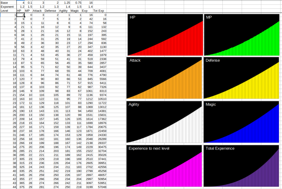
Problem I had with this formula is the stats either start off really low and grow too quickly, or grow really slowly but start at a decent amount.
Tweaked the formula to: stat = start + base * power(level, exponent)
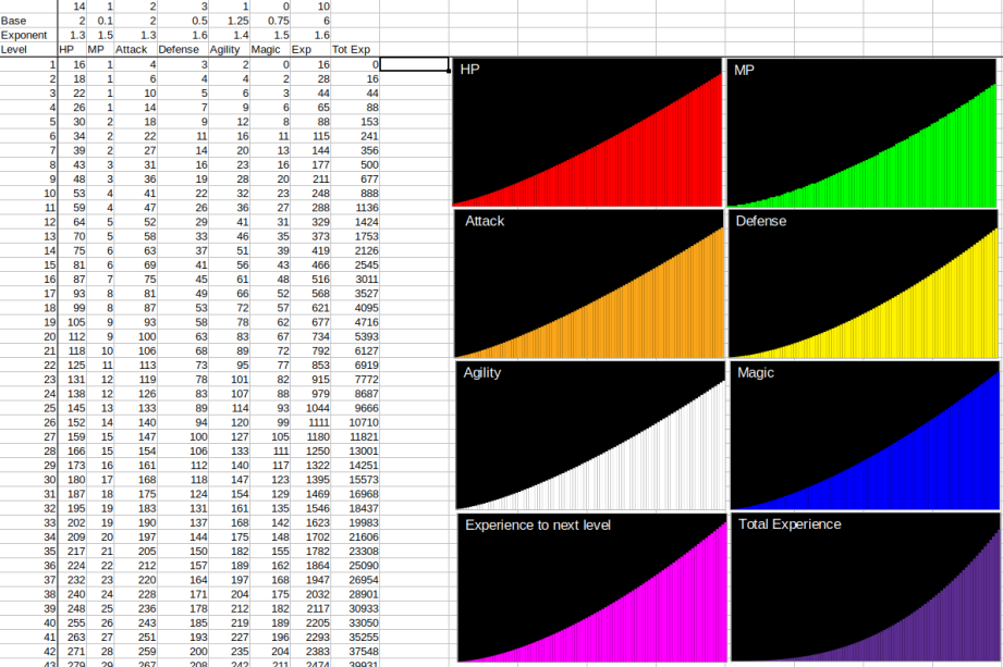
This provides much better starting values with a more steady growth rate. From here I can more easily balance the enemy stats based on the expected level and equipment.
For the battle system the basic formulas so far are:
- Basic attack:
(attack / 2) - (defense / 4) - Critical hit: flat 5% chance
- Surpise attack: generate a random number between 0 and the enemy’s agility. If it’s greater than the hero’s agility then it’s a surprise attack (meaning the enemy performs a basic attack before the player).
- Miss: generate a random number between the 0 and agility * 16. If the number is less than or equal to the opponent’s agility then the attack misses.
Enemies have up to 4 different actions they can perform chosen by generating a random number between 0 and a supplied randMax (per enemy) and then each action subtracts a value from it until it’s less than or equal to zero determining which action to perform. This allows each action to be given different percentage chances of being used.
Each enemy has a custom 24-character intro message and defeat message, as well as a unique 24-character message for each action they can perform (messages are stored in a single file and read into memory as needed one line at a time).
When the menu is in place the player can adjust the speed of the message display and they can hold B to have each line displayed instantly or press A to display the current line instantly.
Currently items and spells are not implemented yet but the core parts of the battle system are in place. Next is to start creating the initial content for the first chapter of the game’s story progression using place-holder graphics so I can create the systems and content while also drawing up the artwork. My goal is to have chapter 1 complete by the end of next week. Once chapter 1 is done the game will basically be at the point of being able to release an early build that would mostly serve as a sort of demo of the game and lead up to the main story hook that drives the rest of the plot.
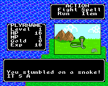
With all that in place I was able to tune the stats for the snake as the first enemy the player will encounter. To do that I looked at the player’s attack stat for level 1 and 2 and set it so that the player will do 1 point of unarmed damage at both levels and gave the snake 2 hit points. I set the snake to only do 1 point of damage but with a higher agility so at level 1 the player’s attacks have a 10% chance of missing, but at level 2 it drops to about 5%. By level 2 the player is expected to be able to buy a basic club weapon that will allow them to 1-hit kill the snakes making them easier to fight.
When running away a random number is generated between 0 and the player’s agility and if it’s greater than half the enemy’s agility (rounded down) you run away. This means at level 1 the player is unable to run away from the snake’s, but at level 2 you have a 50% chance to run away and a 66% at level 3 without any modifiers (there will be an item or maybe a spell that allows instant running away as long as it’s not a boss battle).
So far about 50% of the time you can beat enough snakes to level up to level 2 without dieing or healing. So the first enemy is decently balanced to require minimal effort in the beginning (original stats had about a 25% chance of dieing from fighting a single snake which definitely wasn’t good).
Here’s a GIF of the battle system:
Story wise the player isn’t some knight or warrior, but more like a farmer or peasant (haven’t fully worked out his details yet). So the early game will be intentionally a little difficult to reflect that. I’m also not going with the overly cliche’d story of some chosen hero out to save the world. Without revealing too much this story will basically have a hero that’s also in some ways a bit of an antihero as his entire mission in the game is for his own benefits and only occasionally helps others along the way if it means getting what he needs. There will of course be some cliche’d elements (as it’s nearly impossible to avoid nowadays), but overall I think people will enjoy the story I have planned out and can’t wait to share the first chapter with everyone.
Once I start adding more enemies I’ll be posting a bit of a DevLog detailing how I’m breaking down the game’s progression in terms of when certain enemies start to appear and how I intend to balance their stats to make for an enjoyable experience without requiring heavy grinding to proceed (personally the grinding requirement to even attempt the next area is a bit of a turn off for me).
6 Likes
Today I pretty much focused on finalizing the core FX of the battle system.
When the player takes damage the UI flashes red and the screen does a slight shake.
When the enemy takes damage the enemy flashes red.
When the player’s health is at or below 25% max the UI changes to a soft red.
When the player is defeated the screen now does a fade-out transition.
Here’s a short video of the player’s demise in action (normally I’d post it to YouTube and link it here but the video is <1Mb in size so shouldn’t be a problem):
The game over screen is currently just a blank screen, but that’ll come much later.
9 Likes
Been working out the details for the story progression. I’ve got most of the details for Act 1 figured out with a few of the intermediary places along the way.
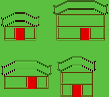
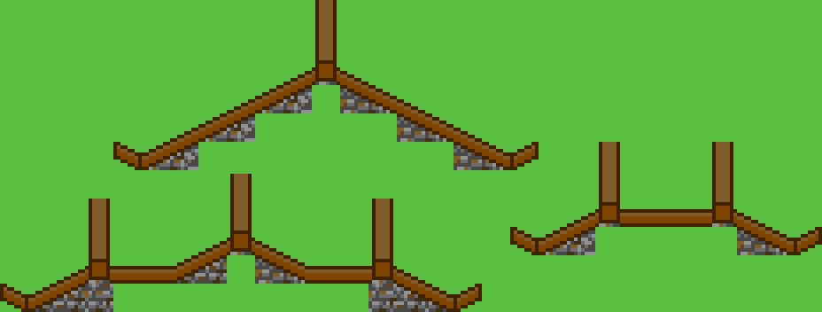
Before I start designing a town it’s good to have some town tiles to use and I wanted to know ahead of time what kind of tiles I’ll have available before I get started for easier planning. To start off the town I mostly focused on the prominent objects which is the buildings. Here’s the start of my building concept with a basic outline shape:
Tested the basic shape to see what types of variances I can get out of it:
Did a basic wall texture (this image is tiled in a 3x3 grid to see the tiling):

There’s very little obvious repetition, but it’s a bit bright and it doesn’t feel very structured to be used for a wall. So I set it aside to be re-colored and used to make the planned gravel pathway.
Here’s the initial concept for the planks along the wall structure:
Looks good, but all the browns are of the same saturation level. So I did another rendition using the 3 different saturation levels available in the miloslav palette:
This allowed me to get a feel for what each detail would look like in the different levels of saturation so that I can pick the best level for each detail and get a good mix of all three:
This is looking a lot better but the vertical planks don’t look very distinct so I darkened them by one value:
Now it’s looking a lot better so back to work on my wall texture. I wanted a rough clay/stone brick type look (not perfectly even stackable bricks, but ones that look to be made/carved by hand):
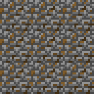
I added some splotches of brown to make the wall look slightly dirty instead of pristine and new. Now to compare it against the wood planks from before:
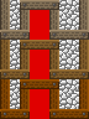
Here’s the basic design concept for the roofing:
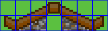
I designed the sloped tiles so that they could be repeated for large buildings. Then I created a flat roof piece and tested some various style roofs to see what kind of variety I can get with the limited number of tiles:
Next I drew up the shingle tiles and finished the basic shape of the roof pieces (still need to detail the beams a bit):
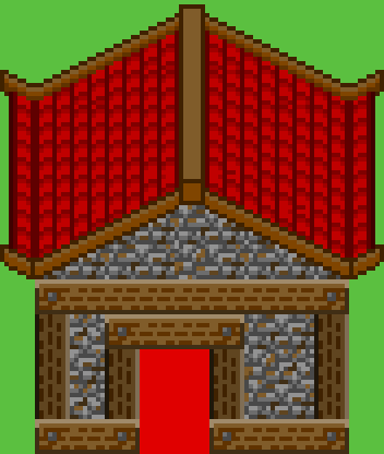
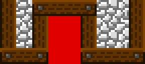
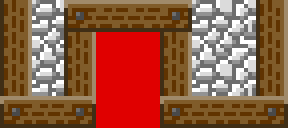
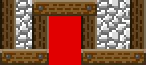
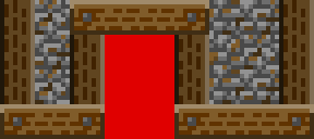
Here’s an example of a larger building with a more stylized roof (the red rectangle is where the door will go):

Got the gravel pathway tiles done (including the smooth edge pieces for better blending):
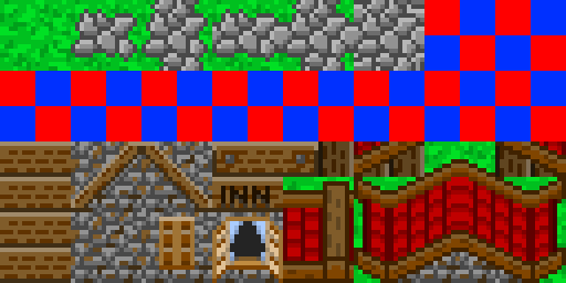
This is where I’ll stop for the night. The remainder tiles will mostly be used for various decorative pieces (like shrubs, carts, etc.). The red/blue squares are the individual 8x8 tiles but the player moves in a 16x16 tile grid and the smaller tiles are mostly for creating smoother shapes.
7 Likes
Today I focused mostly on designing the layout for the starting town using my new tileset. This way it would also help determine what sorts of decorative tiles I want to make.
Here’s the initial layout and design:
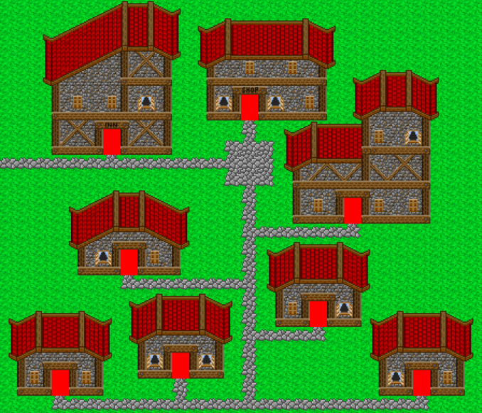
It was noted that I should have a darker grass tile to create a nice shaded area next to the houses. I also determined that the pathways were a bit too narrow but if I made them one space wider it still didn’t look quite right. The pathway issue was because of how the borders were designed. So I added a darker version of the grass tile and re-did the border tiles for the pathway. I also drew up a well tile for the town square.
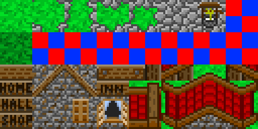
Here’s what the town looks like now:

This looks much better, and while I still have some decorative tiles to work on I’m also going to start working on the interior tileset so I can make the house maps. Once that’s done I’ll also need to make one more tileset (not revealing what yet for spoiler reasons) and then I can add all the decorations in and have Chapter 1 complete.
Once Chapter 1 is complete (which actually takes place entirely within the starting town) then I’ll be releasing an early demo build for people to try out!
6 Likes
Good progress once again!
Few suggestions.
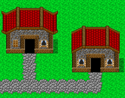
Is it possible to make roofs like the right one? It would bring more variation
The windows could be more distinguishable also.
3 Likes
Yes it is possible to do roofs in that style as well, though I wanted to keep all the roofs within the same town as the same style. Other towns however can use a different style.
Not sure in what way. I wanted to have an open and closed variant, otherwise it depends on what other decorations I make for the towns to determine what tiles I have left for a different window style.
How difficult would it be to do some of the more detailed portions in code? Maybe then they could also be animated  or are you using TAS?
I’m using TAS with my own tile fillers, but the default sprite filler. So far it looks like I can have up to 32 16x24 sprites in a single map easily enough, with space to store 8 16x24 frames loaded from SD for less used ones, while ones used quite often in different maps can be stored in Flash at 384 bytes per frame. Mostly I plan on using the sprites for the doors and for townsfolk (possibly having a few farm animals wondering around as well but I’m not sure yet.
1 Like
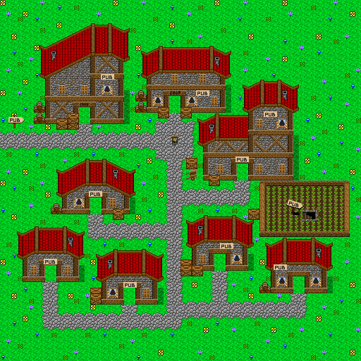
I got the rest of the tiles designed for the town tileset (still have room for one more sign or something small).
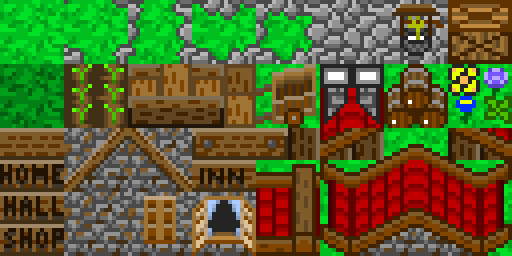
Here’s the town with all the decorations:

The doors will be handled as a sprite. When designing the concepts for the game I went with a 16x16 pixel tile grid but with 8x8 pixel tiles so I could do smooth borders. When designing the town I realized I could actually utilize the sub-tiles to also do decorative pieces as well.
Testing this on HW and it looks really great, but I’ll need to do a couple fixes to the system. Either have the player sprite remain the same size but move on an 8x8 tile grid (could be interesting), and possibly do two tile layers (a background one behind sprites, and a transparent foreground one above sprites). Doing the two tile layers will also allow for secret passageways because walls/ceilings can be placed on that upper layer.
7 Likes
You may need to use a lighter colour for the text on the signs, they seem to be a bit hard to read.
I’m tempted to suggest ‘pub’ as the last sign.
An excellent place for adventurers to gather information.
(And then stagger home half-cut and smelling of cider. :P)
2 Likes
“Well, did you go and defeat the evil Argos?”
“Naah. Jim and Andy were at pub, me and the lads got a bit knackered. I’ll do it tomorrow”
Tomorrow:
“I heard Andy has some information on Argos. I’ll first head down to the pub and interview Andy”
2 Likes
A point-and-click adventure game where the hero never finds his way past the tavern would be so hilarious and true to life
4 Likes
There was a British sitcom with a similar plot to that - a fantasy setting where all the characters live in a pub.
But rather than trying to go on an adventure the protagonist was just trying to get home.
(I’ve never actually seen it so I’ve no clue whether it’s any good or not.)
Just because I couldn’t resist:
“Eyy up lad. Me an’ Andy’s off down’t puhb. I’m right gaggin’ fur an 'alf a bitter.”
“Aren’t you supposed to be out slaying a dragon?”
“Yeah, but me sword broke so ah took it to be fettled. It’s dead 'ard being an adventurer yuh know.”
One of the reasons I like the Dragon Quest series is because they always give the NPCs of different settlements different accents.
(Usually exaggerated and stereotypical accents, but it’s all in good fun.)
2 Likes
Must be Dublin 
4 Likes
Adjusted the map system so it now uses 2 tile layers (one below the sprites, and a transparent one above the sprites). Took a bit to adjust all the code to support two tilemaps and update the town map.
Here’s a video showing the template character sprite walking around the town showing off the layering:
8 Likes