[DEVLOG] Prelude to a Dream

I thought I should maybe do up a devlog for the game I’ve been working on lately. Currently I’m taking a little break from the pinball engine/editor and working with the new pine-2k. My project is a simple RPG game similar in nature to the original Dragon Quest for the NES (Dragon Warrior outside Japan). It features a small 64x64 tile overworld and will have only a few locations to visit. The game’s story will be a “prelude” to a much larger RPG game I eventually plan on making when I’ve finished Pokitto Pinball.

I don’t want to spoil anything on the story so I’m not going to go into details on it (just hope it’ll turn out at least halfway close to what I’ve got in my head). Gameplay wise it’ll be just like Dragon Warrior with a single person party and you fight a single monster at a time with a similar style layout (easier to do in pine-2k).

Here’s a gif of the map navigation fully functional (I’ve borrowed the smiley graphic from the hello world project temporarily):
PINE-SDK.bin.1
Here’s a preview of the battle screen:
PINE-SDK.bin.1
For a long time my biggest struggle with game development has been the artwork. There’s lots of free and paid artwork available through sites like OpenGameArt.org and itch.io but finding a reasonable amount for a complete game that art at least somewhat similar in style can be challenging. For this project I’ve been slowly working on getting better at pixel art and doing all my own artwork.

Here’s the current overworld tileset for example (all my own creation):
world
Here’s the still WIP battle background for fighting in the grass (need to arrange the objects and create one or two more mountains, clouds, and a few more trees, then detail the grass just a small amount):
image
Here’s the overworld map (don’t have any locations added in yet):


This is the current todo list with completed items crossed out (not in any particular order):

  • Map navigation (including loading the map in chunks allowing for larger maps)
  • Random encounters (encounter rate based on the tile and monster list based on the 8x8 region)
  • Battle system (have a screen rendering but no content yet)
  • Story
  • Tilesets
    • Overworld (still need tiles for towns, castles, and other places of interest)
    • Dreamworld (mostly a recoloring of the overworld tileset)
    • Town/Castle
    • Caves / Dungeons
    • Ship
    • Possibly one or two more
  • Sprites
    • Player
    • NPC’s
    • Enemies
  • Backgrounds
    • Grassland
    • Forest
    • Desert
    • Swamp
    • More based on locations of interest
  • Music (Really like the quality of Yubatake’s JRPG Collection 1 and 2. Also it sounds great on hardware.
8 Likes

This is a great looking game so far. I cannot wait to see how you squeeze this into 2K!

1 Like

This DevLog will mostly consist of different iterations of my battle background and the response / advice / examples from the community on Discord. This not only showcases my progress towards this game, but my progress in getting better at pixel art in general, as well as the level of support this wonderful community has to offer not just with programming.

A special thanks to @carbonacat, @Vampirics, and @FManga for your responses, encouragements, and general advice. The support of this community has really helped me improve my skills with pixel art.

Here’s version 0.2
grassland
Most of the pieces are in place and is starting to look decent.
@carbonacat suggested adding some outlines to the trees or removing the outlines from the mountains since it creates a bit of a clashing style, otherwise the mountains feel like another object.
@FManga suggested maybe making the outline on the mountains subtler if the palette allows.
@Vampirics mentioned that he found the wall of trees on the right made the view feel a little unbalance.
@carbonacat also suggested that adding a monster (even a temporary placeholder) could help on proportions, placements, and a good outline.

Here’s version 0.3 (added a nice outline to the tree)
grassland_v0.3_treeOutline
@carbonacat mentioned that this was already more consistent, but also pointed out to be weary of the perspective because if the trees base is the same level as the mountain it makes either the mountains look really small or the tree look really big.
@FManga mentioned that since it’s the background removing the outlines would help make the foreground easier to read.
@Vampirics pointed out that since I’ll have a different background based on what tile the player is on (grass, forest, desert, or swamp) then I don’t necessarily need all of the elements on a single background.
I mentioned that I wanted the grass terrain to not just be a totally empty field but show the more dynamic range of terrain around it. Primarily thinking the trees and mountains that are all around the grassy areas.

version 0.4 added a shadow to the tree
grassland_v0.4_treeShadow
@Vampirics said it’s getting there
@carbonacat pointed out to be careful with sharp shadows because it pinpoints the location of the sun which makes it so all objects (including enemies) must follow suit.
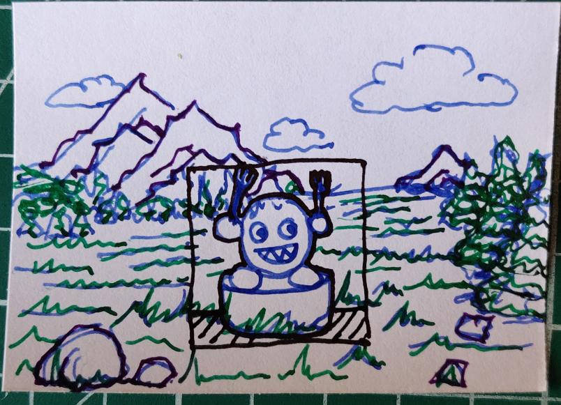
Then provided me with this little sketch helping put things in “perspective”


My initial thought was it looked like Kirby standing on a pedestal with eating utensils in hand ready for his next “meal”
@Vampirics pointed out that this image’s composition is spot on really.
@carbonacat commented that he simply made a mix between the concept I’ve got so far and some battle backgrounds from Dragon Quest.
@Vampirics stated that this is what I need

I realized that having just one medium sized rock and maybe a few pebble sized ones in the very front would help bring out the perspective a bit more. Also that I could scale the trees down slightly as they get further away.

Then I got some more good advice from both @carbonacat and @Vampirics on having even just a couple enemy outlines or placeholders (one small and one big) would help line things up better. This would help balance the artwork on each side to guide the player’s attention towards the center and that a nice amount of empty space can also make it more polished.

With all that in mind here’s version 0.5 where I added a few more trees by scaling them down the further back they were. Didn’t scale them enough though :man_shrugging:
grassland_v0.5_moreTrees
@carbonacat said the trees do look better like this but the mountains base shadow might need some work.
@FManga asked if the mountains base needed to be flat since it makes it look more like a rock sitting on the grass.
So really quickly did version 0.6 by touching up the mountains base so it’s not so flat
grassland_v0.6_fixedMountainBase
@Vampirics mentioned that “outlines are not needed all around most of the time, try to use outline only when you need to contrast with something more”
@carbonacat added, “like, for trees, you’d outline the top of them so they’d contrast with a faraway objects, but not against each other” and “same for mountains, you could think of them as a chain instead of individual mountains, etc”
This helpful advice led to version 0.7 where I merged the two mountains together into one.
grassland_v0.7_mergedMountains
This inspired @Vampirics to share a modified example of how a polished version might look, complete with a sample enemy.
grassland_v0.7a_vampiricsExample
I stated, “The feedback on my artwork has been really helpfull as I slowly get better and better at it.”
Also that I imagine the other battle backgrounds won’t take as long since I’ll have a much better grasp of the steps and methods involved.

With all that I did version 0.8 and thought I was getting really close to a final version
grassland_v0.8_niceBoulder
@FManga “I like that rock. That is a nice rock.” and I corrected him that it’s, “I like that boulder, that is a nice boulder” :laughing:
Otherwise the only real suggestions here was
@Vampirics mentioning that maybe the mountains base should be more level with the horizon so they appear way off in the distance.
@carbonacat the shadow is quite long and doesn’t fit with the trees very well.
Version 0.9 fixed the shadow a bit on the mountain
grassland_v0.9_fixedMountainShadow
The overall consensus was that the scaling for my trees was still off quite a bit.
Learning from @Vampirics example I noticed that it could also really use a much larger tree in the front, a medium one part way back and some really tiny ones way in the back.

Following that was a good discussion on the things I’ve done so far to get to this point with this background, the things I’ve learned along the way, and how best to proceed to doing the remainder battle backgrounds.

To make this part easier I’ll just paste the relevant chat messages here:

@Vampirics You are really getting there, it’s all about those details.
@tuxinator2009: Yep
@Vampirics: Sometimes it’s even a good thing to exaggerate a little so that the idea is clear
@tuxinator2009: First I spent some time learning how to draw decent clouds which were easy enough to place since they don’t clash with anything for size.
Then I learned one method for drawing some decent mountains, followed by some trees.
Now I’m learning how to put all the pieces together and cast the final shadows.
@Vampirics: Once that is done just repeat the same steps for the other bg and you are set
@tuxinator2009: Yep
I think the process for the entire background really is similar to the process for each piece. The pieces start with a basic shape, add some detail marks, make some shadows and highlights, touch up the details. For the whole BG it’s just make the individual pieces, arrange them a bit, adjust sizing based on perspective, cast shadows out from each piece (paying attention to how the shadow from one piece can cast over another).
So the really small rock on the right by the trees will be slightly darker since it’ll end up in the shadow of a tree.
@carbonacat: usually you’d prefer starting from the general picture then go into details
@tuxinator2009: Right, do each together at the same time. Make some basic shapes, arrange them and adjust scale, add minor details (like the initial crack lines on the mountain), then start shading the results based on where everything is.
@carbonacat: yeah
@tuxinator2009: I’ll probably keep the unscaled tree (the closest one) and make it the middle tree since it’s rather nice. Then I can make a similar style tree that’s bigger and one that’s smaller (without actually just scaling the original).
@carbonacat: oh right, when you’re scaling pixels, it’ll almost always break the outlines
@Vampirics: In my example I really just scaled :stuck_out_tongue:
@tuxinator2009: Yeah the two downscaled trees look totally butchered :laughing:

And now we have the final version 1.0
grassland_v1.0_betterTrees
Here it is with the example sprite provided earlier by @Vampirics
grassland_v1.0_withGiantPokitto
Overall I’m really happy with the final result as it adds depth to the scene without taking too much attention away from the monster. This will be the final version to be included in my game as I think If I did anymore on it I might just make it worse.

Again I’d like to say thanks to this wonderful community for helping others improve their skills and abilities and learn new things. I wanted to share this particular experience with others so that they can follow along as well as know that there’s plenty of helpful people here regardless of what you’re struggling with.

6 Likes

This is really moving along nicely. It is great to get some feedback from people who know what they are doing!

2 Likes

Yup, you’re making great. I usually get stuck right at begin of putting the first pixel down.

Wouldn’t be nice to have some pixel lesson from our in house artist :wink:?

3 Likes

For today’s DevLog I pretty much spent the whole day working on the battle background for the forests. Again still learning a lot of tricks when doing this. Mostly today I was learning how to balance the foreground and background objects without obscuring the enemy sprite (since the whole thing is drawn behind the enemy), also how to add detail to tree trunks and create a nice little piece of shrubbery.

Here’s the two reference examples I started with to get somewhat of an idea how I wanted to proceed:


The idea I had was to have a small clearing in the center with a couple big trees in the foreground on either side, some mid-size trees halfway back, and several small trees lining the background. Then I wanted to add some forest debris (twigs and leaves) to the ground and a bush. I still need to add at least one more bush, and possibly a couple moss-covered rocks on the ground.

Here is the order of appearances I posted over on the Discord channel to help showcase my progress:
image 
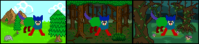
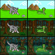
A nice start getting a rough outline
image With the Giant Pokitto for reference
image Wasn’t too happy with the path idea
image This style looks better with an enemy now
forestLayers 
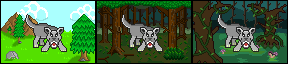
Showing off the layers being used to help tune everything
image 
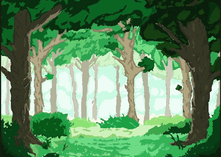
Switched over to doing a really dark forest background instead
image Fixed up the outlines so the objects don’t appear to float
image image Couple experiments for doing the tree trunks
image 
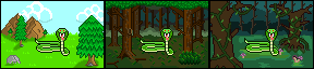
Found a nice tutorial on a style of trunk I liked
image Did the rest of the trees in the same style
image Added the canopy, some background brush, and fixed the branches
At this point @jonne mentioned that I’m dangerously close to becoming addicted to pixel art :laughing:
Personally I think I’m already past that point as I spent an entire day doing pixel art and can’t wait to finish this one and do the next one :joy:
image Fixed up the shrubbery a bit. Pretty good final results for it
image Shaded the ground a bit so it’s not so flat, and blended the horizon line
image Wouldn’t be complete without the Giant Pokitto for reference
Not sure if I want to accept it as is, or if I should maybe add another bush and one or two moss-covered rocks to give it some more detailing. As it stands right now this is looking really good. At one point I added a few nice looking mushrooms but removed them as I wanted to save them for the swamp background. Now it’s getting late and I need to go to bed so I’m leaving it here for now.

Pretty soon I’ll start making some enemies to go on these backgrounds and that’ll present a whole new challenge for me in my quest to get better at pixel art.

Biggest advice I can give to others based on my own experience so far is this:

Don’t give up, don’t doubt yourself, and don’t worry if it takes you all day to do a single piece of art. Just like everything else the more you do it the better, and faster, you’ll get. Someone like @Vampirics could probably do a much better job than my current abilities spending no more than an hour or two at best, but he’s also been doing pixel art for a very long time. You’re may not go from noob to pro overnight, but keep at it and you’ll get there.

6 Likes

A very nice tutorial. It is very educating to see how it progresses and evolves :slight_smile:
One thing to comment is that the green area on the top might look too much like a solid thick layer. The could be some details or texture.
Overall the picture looks very good!

2 Likes

@tuxinator2009 you are becoming quite the artist!

I agree with @Hanski, this is a great little diary of the progress you are making. I cannot wait to see the game itself.

4 Likes

Great job so far! Don’t oversell me lol i am not that great at pixel art. Am a graphic designer but not in the gaming industry. So pixel art is bot something i have been doing for long.

You are doing really well and am proud of your progress! Soon we will call you for help for ppot games :smiley:

6 Likes

Next thing you know you’ll be hiding image editors around the house and we’ll have to book you in for rehab. :P

Take it from someone who knows what it’s like to have hundreds of unfinished projects: it’s good enough, stop tweaking it or you’ll never move on to anything else.


If you weren’t so occupied I’d be borrowing you to do some pixel art on one of my projects.

3 Likes

Please don’t give him any more reasons to postpone the Pinball Engine :stuck_out_tongue:

6 Likes

Today I got the background done for the swamp area. Even though it’s taking most of a day to do each background (with some breaks here and there), the results have been really great so far and the effort really shows (especially when looking at the individual stages).

This is the initial outline for the overall concept:
Mostly wanted a watery swamp with a mound of grass/moss in the center for the enemy to rest on.
image
Here is the same image but changing the colors slightly to see what works best.
image
After looking at some example images (both pixel art ones and real life swamps) I decided to have the tree be very close to the viewer with another slightly further back. Also changed the coloring again to give the water a murky green color (think algae covered).
image
I’ve dotted the background with some brush and added some shading to the water as well as a few smaller patches of grass above the water. The roots of the tree on the right go down into the water so they’re offset slightly and faded a bit.
image
Cleaned up some of the background brush that’s in front of the background trees so it doesn’t look as full.
image
Added vines covering the first tree. Really liked how they turned out.
image
Saturated the roots a bit more and shifted them better. Now they look more submerged in the water.
image
Tried a few different outline colors for the trees (only changing the right tree for comparison). The last one looks more “radioactive” but otherwise it didn’t turn out well so I went back.
image image image image
Instead I saturated the two foreground trees by one level on the palette and two levels for the background ones giving everything a more murky look.
image
Finally, fixed some minor details, added vines to the second tree, added a few mushrooms, and shaded the grass mound a bit better.
image
Then suddenly a Giant Pokitto appeared out of nowhere!!!
image
I like this final result rather well. Didn’t end up needing to detail the tree trunks because any detailing would have just been obscured by the vines and would have made it look more disjointed. The idea for the roots of the trees was that the ground has eroded away a bit from all the water causing the roots to be more exposed and slightly submerged.

Here’s a side-by-side comparison of the three backgrounds I have so far (grassland, forest, and swamp):
grassland forest swamp
Now the overworld just needs a desert background and then there’ll be a total of maybe three or four more for the different areas to explore.

7 Likes

A very nice and atmospheric picture again! The difference is really huge compared to first sketches. This could encourage people to try drawing.

I noticed that in the swamp image the trees are not shaded. Is that because you want it to look murky? Only the grass mound is shaded.

1 Like

I think your tree drawing skills have improved dramatically!

Without trying to sound rude, you might need to readdress the ones in the first scene as the tree on the right looks a little too uniform. The branches are all the same length and it makes it look like a pencil - they possibly need to be more conical.

image

Having said that, it so much better than anything I could do! Great work.

1 Like

Wasn’t able to do much yesterday as I was busy reorganizing my office, but I was able to start work on the wolf enemy sprite. Today I finished up the shading and minor detailing left to do.

When starting work on a sprite I found starting with a solid color shape helps with refining it. Keeping the individual pieces (head, front legs, back legs, body, tail) a separate, high contrasting, color and on separate layers helps with refining the individual shapes and/or placement of each piece.

Here you can see the initial shapes and pose idea:
image
Tuning the shapes more and working on the mouth (I wanted the wolf to be snarling)
image
Quickly jump over and get a size comparison against my 3 backgrounds. Noticed a perspective issue with the swamp (@carbonacat pointed it out as well) where parts of the foreground tree are behind the sprite (this will be fixed later).
image
Lowered the head a bit so it looks more poised to strike and fixed the mouth considerably (like this version a lot better).
image
Didn’t like the roundness of the ears (neither did @torbuntu haha) but by adding 1 pixel to the outline in the outer corners and removing 1 pixel along the base of the ears made them look far more pointed and wolf like (@torbuntu said they originally looked more like bear ears, and I have to agree :stuck_out_tongue:)
image
This is where I left off last night, base color scheme was chosen and now it just needs minor shading and touching up details.
image
And here we have a completed wolf sprite. I tried using dithering to create a drop shadow but it didn’t fit well on the different backgrounds.
image
Here’s the wolf against the different backgrounds (notice I fixed the swamp by cutting the branch back a bit and removing the hanging part of the vine).
image

Overall I actually only spent maybe two hours, three tops, on this sprite. So if I were to dedicate a whole day to making enemy sprites (and knew ahead of time which ones to make) I could probably get a decent amount of them done.

The nice thing about this style of game though is that I can recolor (and/or reshape the head) and get a few more enemies out of the same sprite. For example if I reshape the head and recolor the body to have a white underbelly, thinner tail, and an orange body with black stripes then I would have a tiger. I could also make the body more tan in color and call it a saber tooth cat. In the meantime I already have an idea for some of the other sprites I want to do.

5 Likes

Just finished another sprite and this one took very little time. I’m definitely starting to get the hang of the different techniques.

I wanted to make a snake enemy sprite so I found a good reference image of an actual snake and cropped out the background. Different color than I’m going for (was thinking mostly green), but the pose is pretty much spot on with what I had in mind.


Taking that example image the next step was to simply trace out a really thick outline then scale it down to the size I need (using a smooth interpolation so as not to loose the overall shape) then touch up the results to get the final outline shape (used red for the outline so it stands out better).
image
Finally did some minor detailing and coloring
image
Now I have a problem with size though. I made the enemy to fit a 48x48 area but regular enemies should only take up a 32x32 area otherwise they’re way too big.
image
Took the original pre-scaled outline and scaled it down to the correct size, fixed it up, colored it in to get a solid shape, then tested to see how it looked. The results are much better now and it looks like a more proper size.
image
Re-did the details, coloring, and finalized the shading and here we have a great snake enemy.
image image

There’s many different techniques for making good pixel art. I’ve been having a lot of fun learning the different techniques and figuring out which ones work for me and which ones don’t.

6 Likes

Did a little bit more today.

Touched up the trees on the swamp background so they’re a little better detailed
image
Removed the two main trees from the grassland background (the bigger one will be saved as a possible enemy).
image
Here’s a comparison of the two enemies I’ve got in the same spot on all three backgrounds to see how well they all work.
image
Experimented with some basic shapes in Blender to test my perspectives and texturing
image
The wood texture in blender makes for a more “stripped” log type texture, but cropping just the left most tree and reducing the colors from the original 418 unique colors to 6 helped show what was missing for my swamp trees.
image
Mostly it looks similar but I noticed that what I needed was a few short straight lines of the lighter color to help bring out the depth better.
image
Then I started work on a background I’ve been wanting to do from the start but was waiting till I got a bit better.
image
After some touch-ups, shading, and detailing here’s the result
image
The barrel was taken from my Dragonrush pinball table design so the perspective is slightly off on it compared to everything else but should be easily fixable with some more touch-ups.

The main thing I wanted to focus on for this background was getting away from the more traditional RPG ship backdrops which were always looking straight down the length of the boat or straight at the side. Instead I wanted to give a more angled view because I felt it would look more interesting and full.

Overall I’m very happy with how it turned out so far, and now it just needs some minor touch-ups on the barrel and it’s good.

Thought I would also share a link to a tutorial I used quite some time ago to get started with better programmer art.
https://www.gamedev.net/tutorials/_/creative/visual-arts/better-programmer-art-r2594/

It has some really great advice on making good programmer art with various tricks. It wasn’t until now that I really started experimenting with pixel art and with the help and guidance from some of our more artistic community members I’ve been able to bridge that gap between passable programmer art and good quality pixel art.

As a reference here’s all the pieces I’ve done so far for this game
world
wolf snake
grassland forest swamp shipdeck
They’re all looking wonderful and I can’t wait to continue making more.

EDIT: Just realized I made a simple mistake with the board on the ropes. They’re supposed to go through the board. Here’s the fixed version.
image

6 Likes

The ship looks great. My only comment is that the ropes are too close in colour to the sky and therefore are barely visible.

That was actually kind of the intent interestingly enough. If I made the ropes 1 pixel lines they seemed thin and unstable (like string rather than rope). When I made thdm 2 pixels thick with one color and tried 2 colors they came out really thick. So I tried for one pixel of the rope color than highlighted it with a color closer to that of the sky. The result is that they blur into the sky a bit appearing bigger than the 1 pixel lines but not as thick as the 2 pixel ones.

2 Likes

I fixed up the barrel and added the shadows for the ship. To make the shadows appear more natural I drew the shadow shapes on a separate layer then picked a darker version of each color and replaced the ones under the shadow. That way it keeps the same texturing and details, but looks slightly darker from being in the shade. This felt better than a hard shadow because light naturally bounces off objects adding light to areas not in it’s direct path, especially sunlight.
image
But I think that might be all I’m going to be able to do today.

3 Likes