Thanks for all this info @jonne! This is awesome!
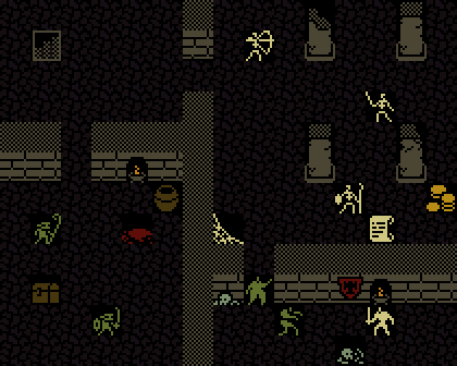
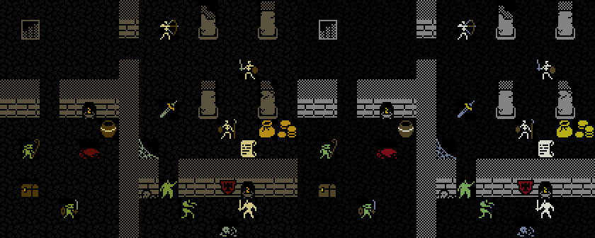
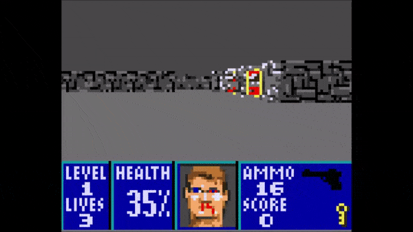
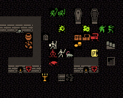
It seems with the enemies we are moving towards the original, more saturated/prime colors. That is not a bad thing by any means and it gives me a ballpark to shoot for. I will make sure the luminosity is similar in the colors we use together.
As for the floor, I wanted it to be almost invisible, just giving a hint of texture (which seems to be doing on the picture of the screen you attached). This is so when we have sprites on it with solid black bg, it is not as noticeable that the floor texture is missing 
I will experiment with adding a little detail to signify where the tiles are, so a player can easily judge how many steps they need to take (probably just adding the corner dot as in CGA version, it works well and is reminiscent of ASCII).
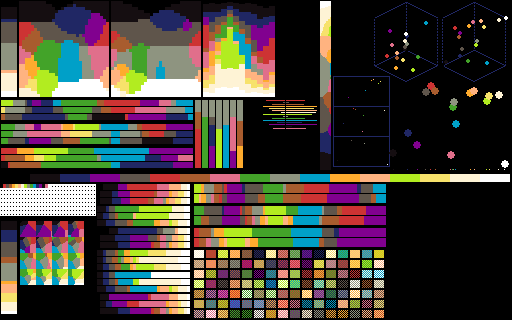
On the technical level, it seems that we will only have a change of color visible if we increase R,G or B by 8. I assume any difference of less than 8 would be rounded down (so a value of 39 would probably end up as 32). To keep it safe, I will try to get colors with RGB values divisible by 16 whenever possible.
Lastly, in your generated examples there seem to be multiple colors per tile on walls (mainly gray and brown that create a bit of a random pattern). Is this due to jpg artifacting or should I shoot for a dither (I assume dithering won’t blend colors as it is a LCD screen after all).
What I will do is go back to the original palette and tweak it more towards the sickly green wherever I can and we can take it from there.
I think the multi color enemies (with tweaked brown) look pretty neat and draw your eye to them, I am leaning towards leaving them multicolored. Opinions @jonne, @adekto, @trelemar, @wuuff?
Edit:
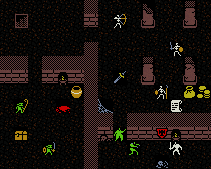
Here’s some updated colors. Those are very close in luminosity for all the non-background sprites (with the exception of “white” which is obviously a little higher on luminosity scale). Those colors should technically display correctly in 5bit (all RGB values are divisible by 8, majority of them, by 16).
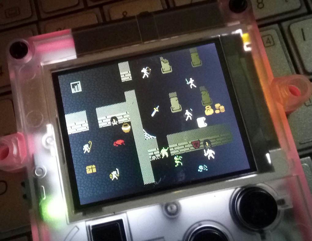
I know that the screen looks quite yellowish. Should I go with more generic colors instead of the sickly variety?
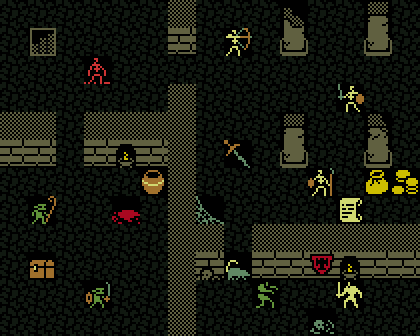
We can always revert to the original that has a bigger hue spectrum.
Edit2: Looking at it zoomed out like that, I am not a fan of the yellowish look. Here’s one using the original palette for comparison.
I think it looks much better. It has much stronger colors so pokitto screen should handle them well (we can also tweak them to have RGB values divisible by 8 or 16).
I vote for this palette (with some potential tweaks to accommodate for the screen changes), but I want feedback from you guys first.


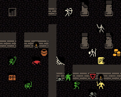 OLD
OLD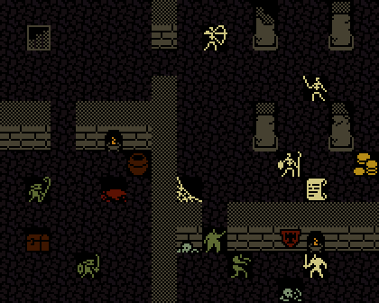 NEW
NEW